 image by António Martins, 8 April 2018
Last modified: 2020-12-26 by rob raeside
Keywords: t | book | sun: 15 rays | rgb-mb | r.g.b.-m.b. | resistência da guiné-bissau | guinea-bissau resistance | bafatah movement | movimento bafatá |
Links: FOTW homepage |
search |
disclaimer and copyright |
write us |
mirrors
 image by António Martins, 8 April 2018
See also:
It was founded in 1986 as Movimento Bafatá (Bafatah
Movement — named after a town
in eastern Bissau Guinea), still during the single party regime of
P.A.I.G.C. In 1991 it changed its official
name to Resistência da Guiné-Bissau (Guinea-Bissau
Resistance) and got a solid 3rd place in the 1994 parliament elections
(19 seats out of 100). Its electoral results have been falling ever since
and there’s currently no R.G.B.-M.B. representatives in the
parliament, the party having obtained under 2% in the 2004 election.
António Martins, 7 March 2010
 image by António Martins, 7 March 2010
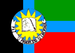
The [first] flag of R.G.B.-M.B. is shown as #2 in both
ballot papers reported. It is divided in three panels like the
national flag — black at the hoist and
green over red at the fly, with a thin light blue laying "T" overall
covering the seams of these panels; centered over the intersection a large
round emblem (~2/3rds of the height), also light blue and filled with a
yellow sun charged with an white open book and a white with black
capitals scroll along the bottom edge. The flag ratio is roughly 5:7 as
most others’ in the ballot papers are.
António Martins, 7 March 2010
The scroll reads the words "paz" (peace), "progresso"
("progress"), and another word.
António Martins, 7 March 2010, and
Eugene Ipavec, 8 March 2010
The 3rd, illegible word on the scroll, (another) party motto, seems to be "Liberdade"
(="freedom"), according to this birthday cake (!):
https://3.bp.blogspot.com/.../bolo%2BRGB.jpg
António Martins, 9 April 2018
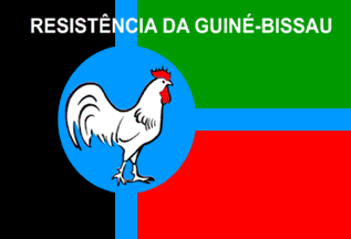
The flag design seems to have changed after the 2008 (or 2004?) elections,
the logo with book, sun, and scroll now replaced with a white rooster and
the name of the party written across the top of the flag in white sans serif
capitals; the light blue stripes seem to be narrower and the disc seems to be
now a standing ellipse, only slightly oblong:
https://4.bp.blogspot.com/.../s400/rgb.png
https://2.bp.blogspot.com/.../s640/rgb.png
According to to this
official presentation, the rooster symbolizes a wake-up call:
http://quadprofgui.blogspot.pt/2017/07/rgbmb-e-o-partido-que-o-povo-guineense.html.
Photos:
https://4.bp.blogspot.com
https://3.bp.blogspot.com
https://2.bp.blogspot.com
 image by António Martins, 8 April 2018
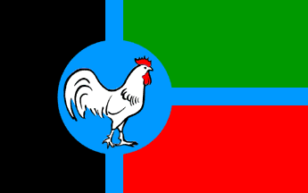
Images lacking lettering and with a
circular disc also exist:
https://3.bp.blogspot.com/...Ba-fata.jpg. I suspect that this is the
original design.
António Martins, 9 April 2018